Frontend Modal Dialogs. When using a web page, certain situations such as form submissions and data confirmations require pop-up alerts or repeated confirmations. If the pop-up windows are clear and accompanied by animation effects, it can further enhance user focus on the operation, thus adding value to the user experience.SweetAlert2 this pop-up dialog plugin, not only boasts an aesthetic design with animations but also offers various customization options. This allows web pages to present a more diverse range of solutions to meet different needs. Now, let’s take a look at how powerful and user-friendly it truly is。
SweetAlert2 Website(Example)
SweetAlert2 GitHub(Source Code)
Native JavaScript Alert
The Web APIs in the browser provide window.alert(“”) for directly popping up messages。
Frontend Modal Dialogs-SweetAlert2
Step
- Import CSS、Javascript
– Place CSS in the <head></head>
– Place JavaScript before </body>
- Add HTML、JavaScript
– Create an HTML Button and declare a click function
– The function is named showAlert()
– Add the showAlert function in the JavaScript section
– Include a call to the fire method of Swal (SweetAlert instance) to execute the pop-up window functionality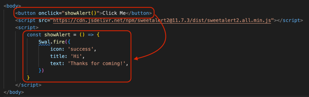
- Code
<html>

<head>
    <meta name="viewport" content="width=device-width, initial-scale=1.0">
    <link href="https://cdn.jsdelivr.net/npm/[email protected]/dist/sweetalert2.min.css" rel="stylesheet">
</head>

<body>
    <button onclick="showAlert()">Click Me</button>
    <script src="https://cdn.jsdelivr.net/npm/[email protected]/dist/sweetalert2.all.min.js"></script>
    <script>
        const showAlert = () => {
            Swal.fire({
                icon: 'success',
                title: 'Hi',
                text: 'Thanks for coming!',
            })
        }
    </script>
</body>

</html>
Code Explanation
- Swal is an instance of SweetAlert2
- .fire is a function provided by the Swal instance to trigger the pop-up window
- Declare a showAlert() method to enable event-triggered SweetAlert functionality
SweetAlert fire Common object variables used
| icon | Icon displayed in the pop-up window | success, error, warning, info, question |
| title | Title of the pop-up window | “String” |
| text | Content of the pop-up window | “String” |
| html | Content of the pop-up window with HTML syntax support | “<h1>String</h1>” |
| imageUrl | Image displayed at the top of the pop-up window | “image url” |
| showConfirmButton | Whether to display the confirm button | true/false |
| showCancelButton | Whether to display the cancel button | true/false |
| showCloseButton | Whether to display the “x” button at the top right corner | true/false |
| position | Position of the pop-up window appearance | top, top-start, top-end, center, center-start, center-end, bottom, bottom-start, bottom-end |
| backdrop | Whether clicking the background closes the pop-up window | true/false |
| customClass | Customization of CSS class | customClass: { container: ‘…’, popup: ‘…’, header: ‘…’, title: ‘…’, closeButton: ‘…’, icon: ‘…’, confirmButton: ‘…’, denyButton: ‘…’, cancelButton: ‘…’, …. } |
Advanced Usage
Customize Button Text
– confirmButtonText: Used to change the text of the confirm button
– cancelButtonText: Used to change the text of the cancel button. HTML can be used here, e.g., <h1>
– HTML syntax can be used for button text
Swal.fire({
  icon: 'error',
  title: 'WoW',
  text: 'You can change button text',
  showCancelButton: true,
  confirmButtonText: "Yaaaaaaa",
  cancelButtonText: "<h1>Close</h1>"
})
Automatic Timer Closure
– timer: Timer unit is in milliseconds
– timerProgressBar: Whether to display the progress bar
– The pop-up window will automatically close when the timer runs out
Swal.fire({
 icon: 'warning',
 title: 'Timer',
 text: 'Auto close',
 timer: 2000,
 timerProgressBar: true,
})
Execute Other Methods After Confirmation
– After clicking the button, the fire method can continue to execute other events
– We use .then to obtain the result of the click event, which is stored in result
(Copy the code below and open the developer console to see)
– Clicking the OK button and result.isConfirmed will be true.
– Use an if statement to check if result.isConfirmed === true to continue executing other events
– Clicking the cancel button and result.isDismissed will be true
Swal.fire({
    icon: 'question',
    title: 'Are you sure',
    text: 'Click OK will show another alert',
    showCancelButton: true,
}).then((result) => {
    console.log(result)
    if(result.isConfirmed){
        Swal.fire({
            icon: 'success',
            title: 'You did it',
            text: 'I\'m new alert',
        })
    }
})
Summary
I highly recommend using SweetAlert2 for web pop-up dialogs. You can find it in many websites due to its simplicity in usage and high level of customization. It offers various options for tailoring to different needs of a webpage, and the transition effects are smooth. I hope everyone can find a set of tools and packages that they can utilize effectively, and SweetAlert2 is one of my frequently used tools. Feel free to leave a comment if you have any questions.